How to Create Adaptable Paywalls for iPhone and iPad Using Superwall
Some practical tips for creating beautiful, high-converting paywalls that work seamlessly across devices and multiple sizes.
Designing for iPad can be challenging, though it's a worthwhile investment. With iPad holding over 32% of the tablet market, you can bet you'll have users on the platform. However, simply expanding your existing iPhone design to an iPad often yields an okay experience — to truly shine, you need to intentionally design for it.
Your paywalls are no different. Today, I'll show you some tips and best practices to help you bring your paywall designs to iPad. Here's the paywall we'll adapt (shown above). And, here's how it currently appears on iPad:
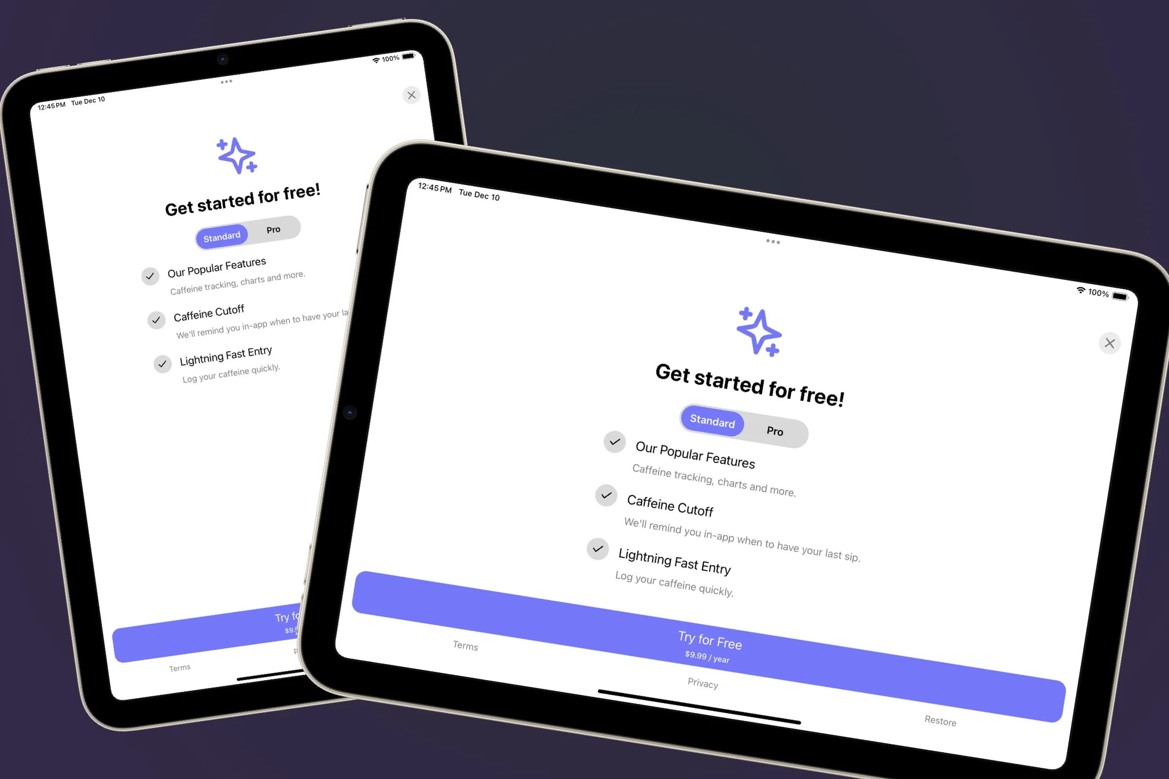
While it's serviceable, we can do better. An iPad has more display real estate (in most cases — multitasking and Stage Manager can yield all sorts of window sizes) than iPhone. I like to start designing for iPad by asking myself two questions:
- Is there anything I can meaningfully add to the interface that helps make the current task at hand better (in this case — our paywall)?
- Can I adapt parts of the current interface to look more at home on iPad?
To work through those, I use Freeform, which is a free app from Apple, to jot down ideas and approaches I might try out:
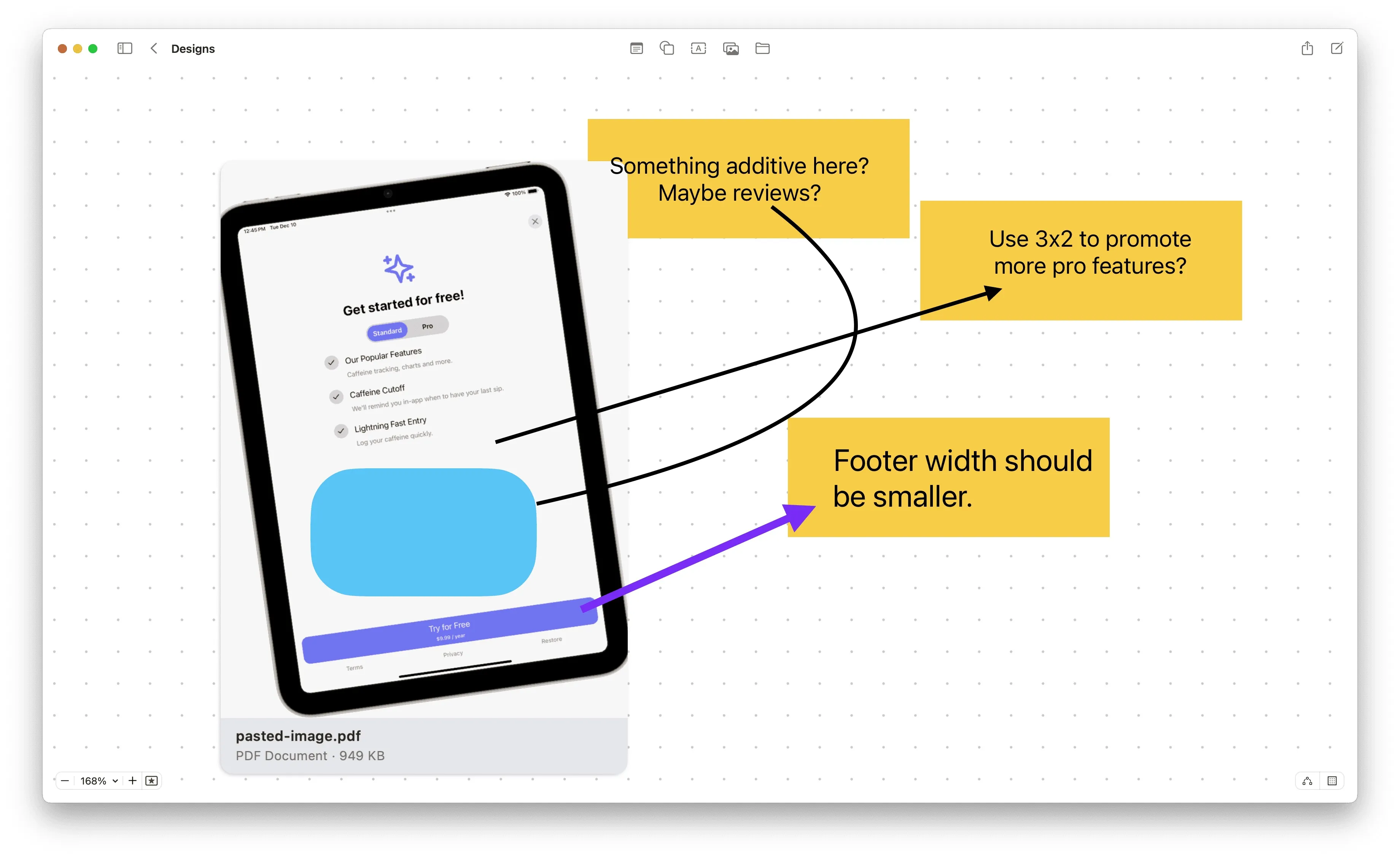
With those design decisions in mind, here's what we will do in the Superwall editor:
- We'll tweak the width of the bottom footer.
- We'll change the bullet list to a grid that's 3x2 since we can allow for more information density.
- Finally, we'll add a new component — some review testimonials to tastefully take advantage of extra space.
Let's dive in!
Changing the footer width
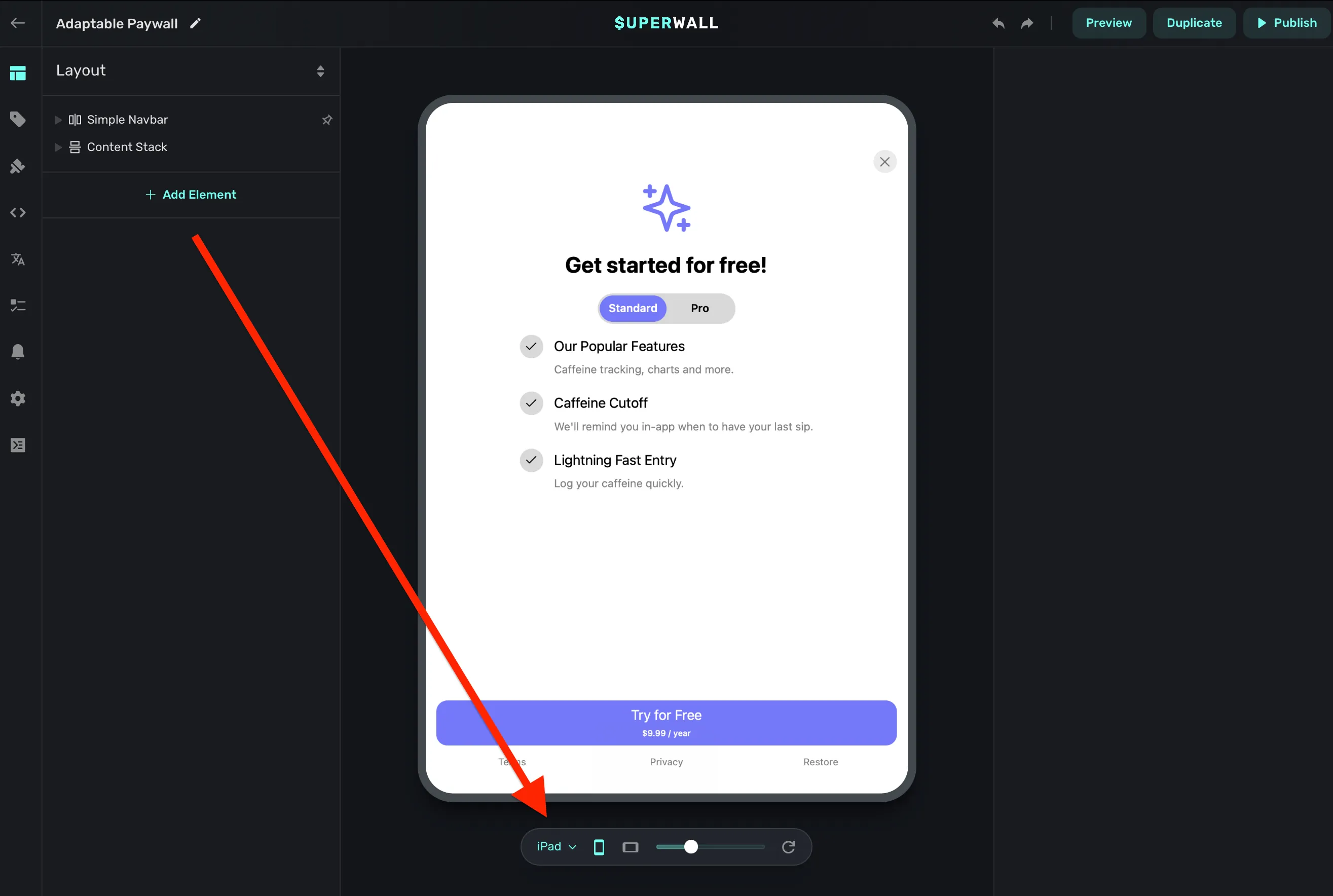
When you open the paywall editor, there is a floating toolbar at the bottom that lets you preview different device sizes. It helps to change this to "iPad" for design purposes:
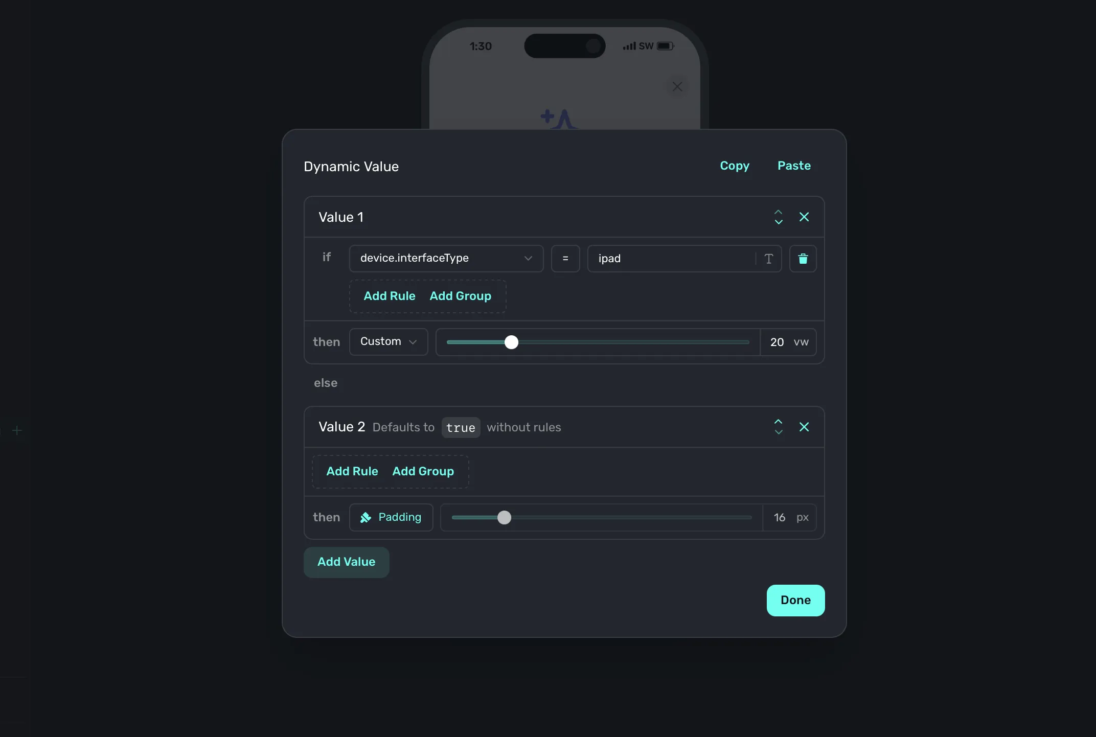
To change the width of the footer, we'll use dynamic values in the editor. If you're new to these, don't worry — they are incredibly simple. Dynamic values are properties you can set that can change or adapt based on some conditions.
So, for our footer's width — think of it like this: If we are on an iPad, it should be X, otherwise it should be Y. And that's exactly what we'll do. This footer already takes up the width of the container, and its horizontal padding is set to 16 pixels. We'll make the horizontal padding be dynamic:
- If it's an iPad, the padding will be set to 20% of the container's width.
- Otherwise, we'll stick with the 16 points.
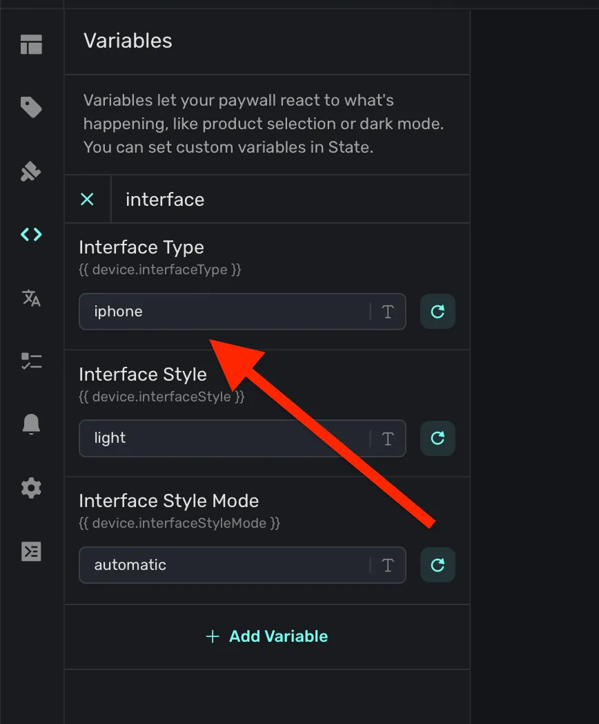
I'll skip the "how-to" going forward for dynamic values, but in case you've not made one yourself — simply click the component's property you're after and choose "Dynamic":
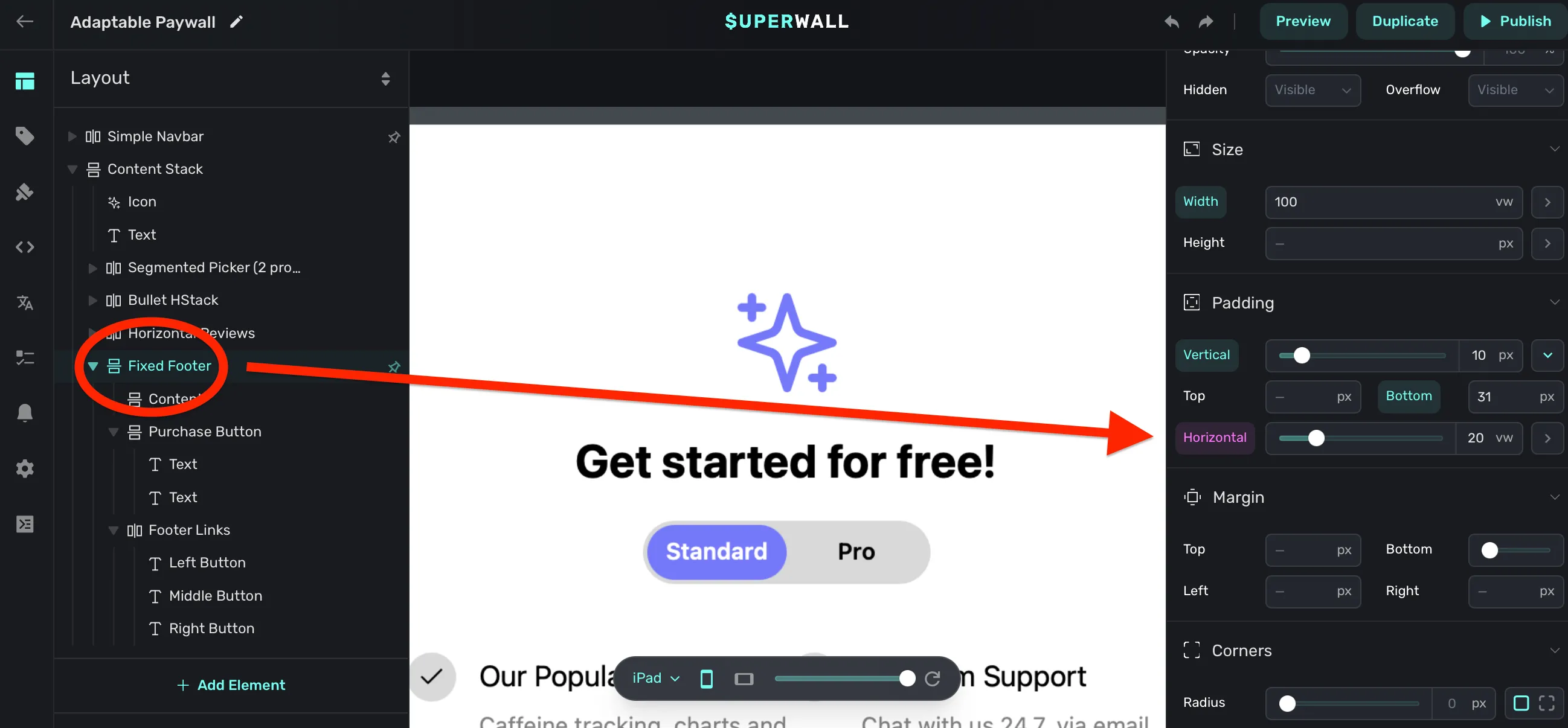
You can tell a dynamic value is being used when the property has a purple background, just like in the image above. Here's how I set it:
Adding review testimonials
Next, I want to do something additive to take advantage of extra space. Here, we'll add a "feature carousel" to show off our happy users' reviews. We have a snippet for this in our component library, and along with dynamic values — this will be trivial to do.
Again, since we covered how to set dynamic values above, I'll move a little faster here. The idea is to add the review carousel component, but hide it on iPhone:
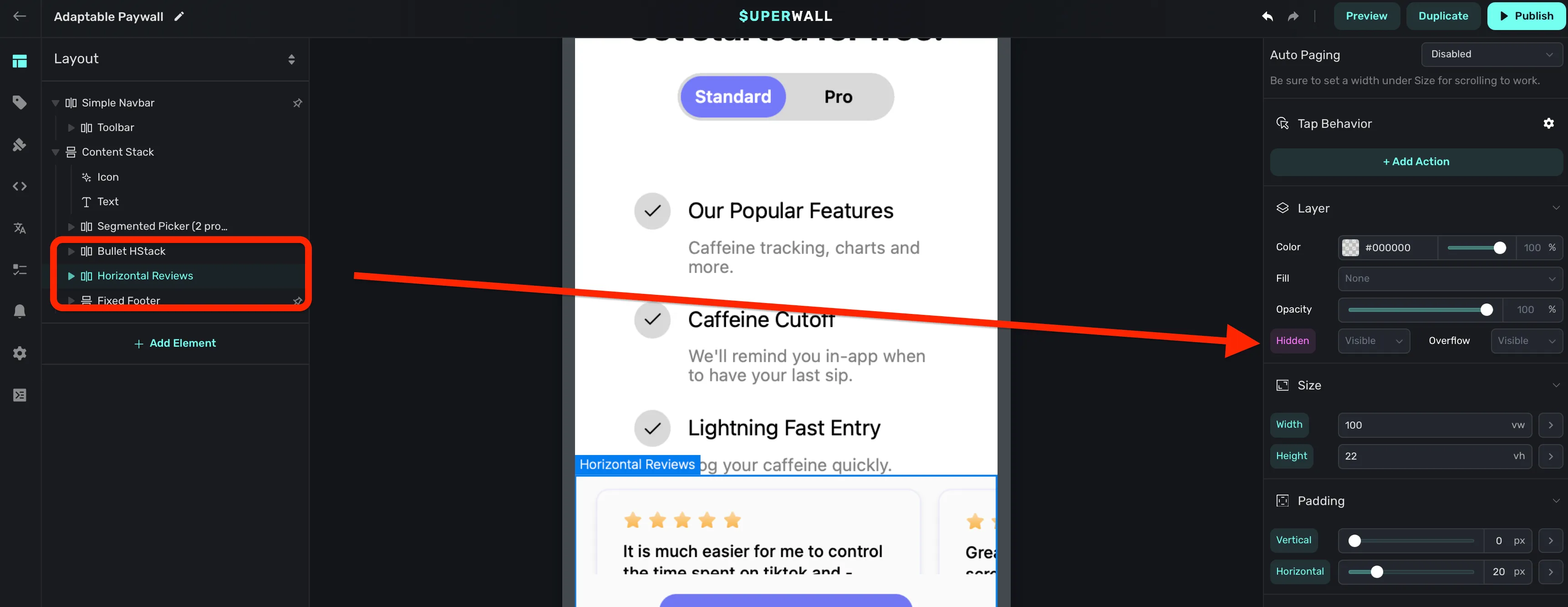
And here's our conditions:
Using a feature grid
While the three listed features showing on iPhone are nice to have, I think we can show off more about what our app's pro plan offers by adding three more. The end goal? On iPhone, the list of three features stays as it is now, but on iPad we'll move it over and add another three features next to it.
Here's what we'll do:
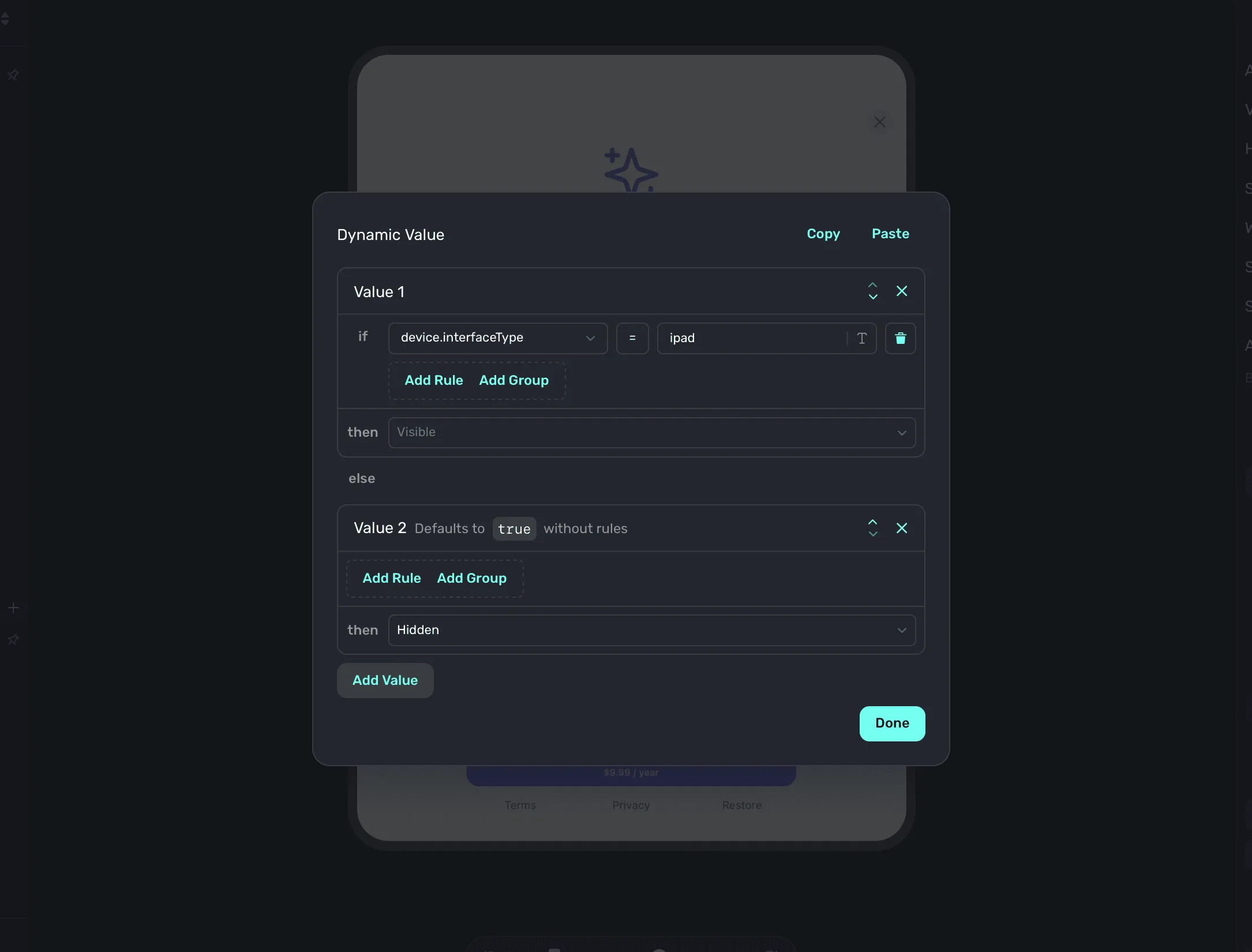
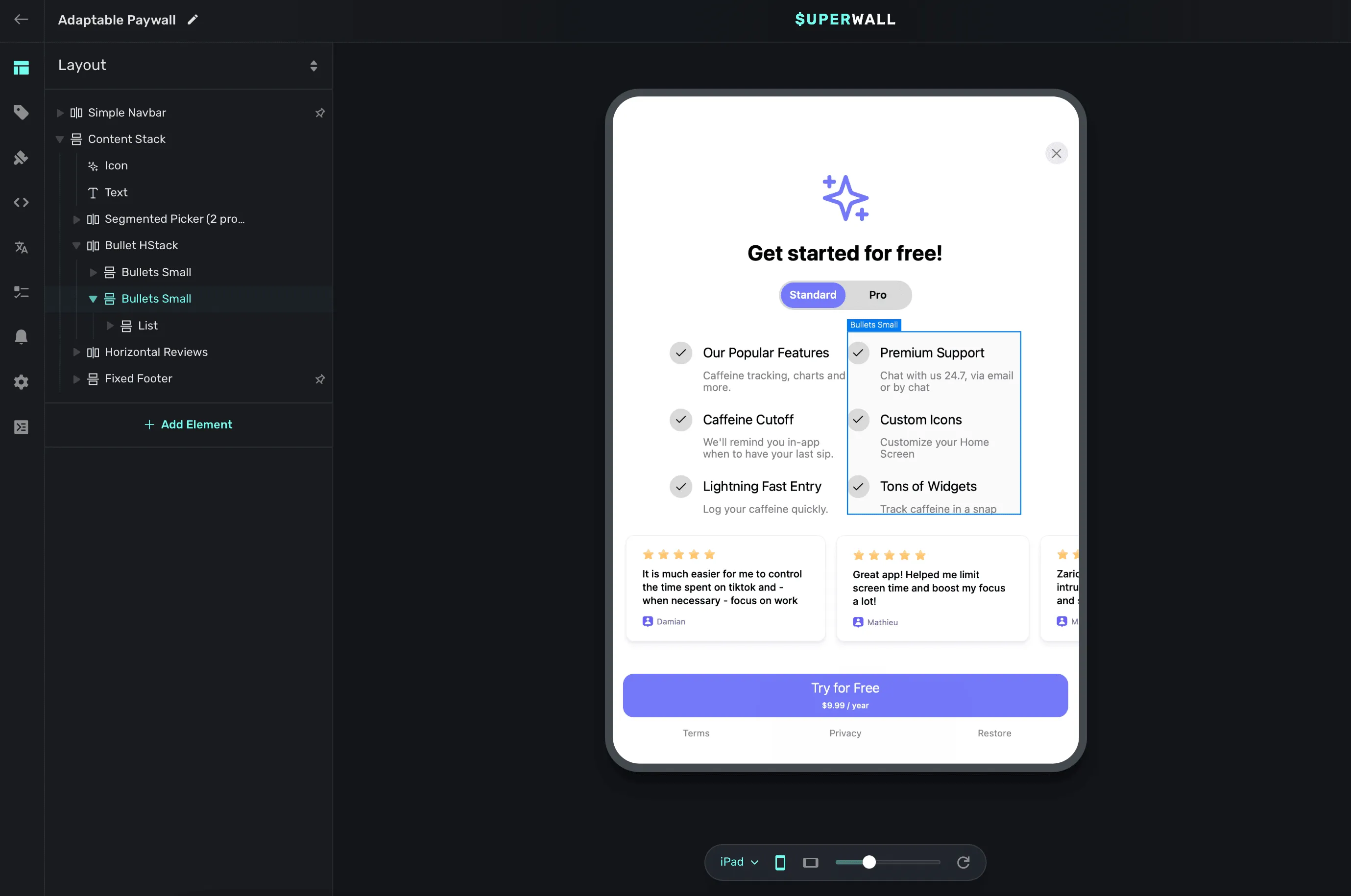
- Duplicate the existing bullet list component.
- Embed the two lists into a horizontal stack.
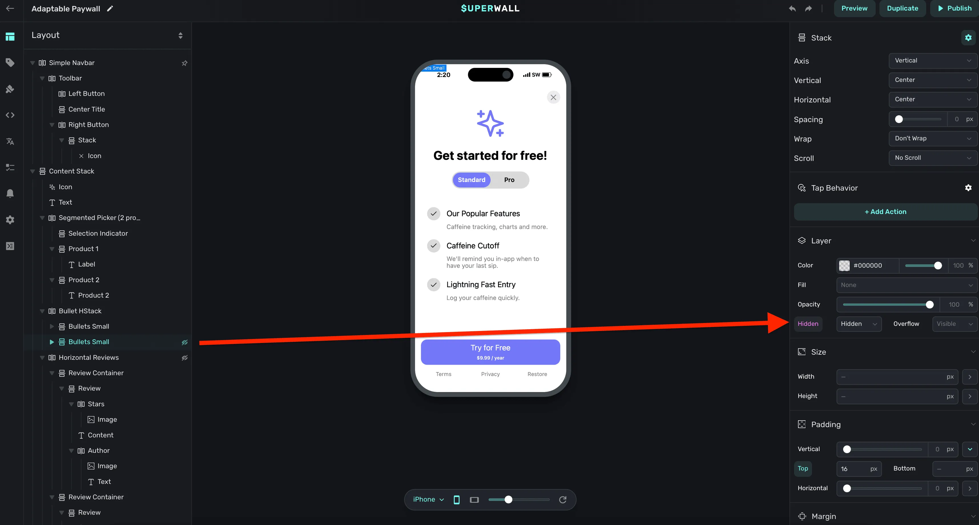
- Using a dynamic value, hide the list meant for iPad when we are on an iPhone.
Here's an example of step #3:
And with that, once we view the paywall on an iPad — we get this nice, 3x2 feature grid:
End result
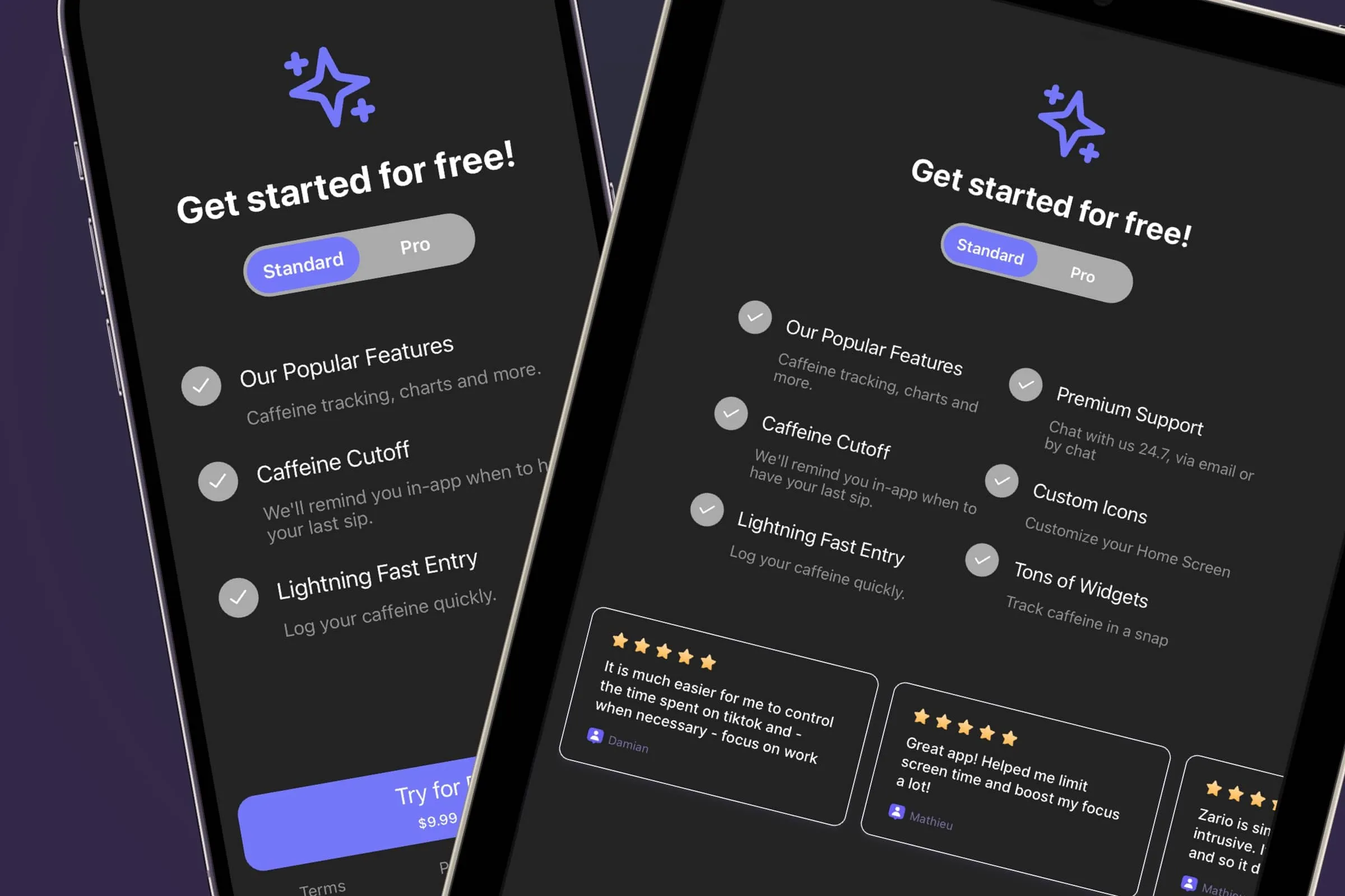
With those three tweaks, here is where our iPad paywall ends up:
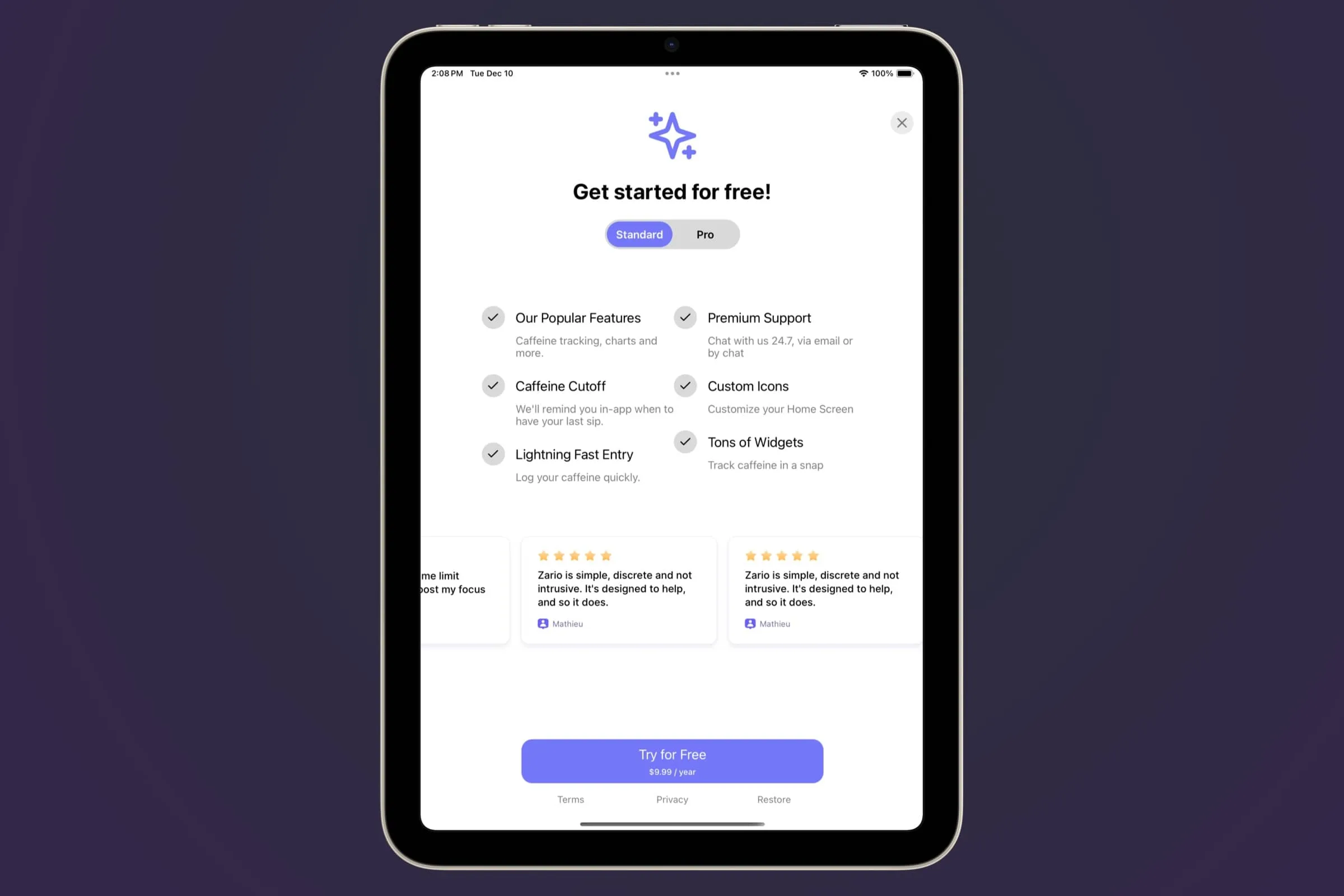
I think it turned out quite nice! And, going a step further and using our theme colors, we can support dark mode as well:
With Superwall's paywall editor, you can build best-in-class designs, interactions, and paywalls. There is no limit. With the tools Superwall gives you to make some small changes here and there, every paywall can look and feel fantastic on any device medium.
Before we go, here is some lasting advice when designing for iPad:
- Responsive Design: Just like with a website, try to think in terms of responsive design. While I've shown a condition that checks for an iPad, in reality a check that looks at the size of the device is a bit more flexible. Remember, Stage Manager and multitasking can mean that your paywall on an iPad could be sized in a window as small as an iPhone.
- Think in percents: Instead of sizing things at X amount of pixels, it helps to think in percents. For example, you might set a container's width to be 60% of the viewport's width instead of setting it to something like 300 pixels. This helps your designs adapt naturally to several sizes.
- Use Dynamic Values: As we've seen here, dynamic values are critical when designing for many different screen sizes. Sometimes, there isn't a percent of value that works across everything. So, adapt it to a value that does work for a given scenario.
Wrapping up
Designing for iPad can help take your user experience to the next level. When opening a paywall that adapts to the device, your app feels a little more cared for than your competition. Our editor was built to help you make paywalls across any device, and hopefully the tips here can help you get started tailoring your paywalls for iPad.
If you have any other advice or need assistance, we're always around to help you get started with Superwall anytime. Why not build some iPad paywalls today by signing up with a free account?