StoreKit paywall views in SwiftUI: The Complete Fieldguide
New in iOS 17, the StoreKit framework introduced several ways to display your products and subscriptions. From showing a store to using advanced techniques, this post covers it all.
New in iOS 17, the StoreKit framework introduced several ways to display your products and subscriptions. From showing a store to using advanced techniques, this post covers it all.
Apple's StoreKit framework can produce a paywall in just a few lines of SwiftUI code. But how do they work, and when would they make sense to use?
StoreKit view types
It's probably no surprise that these views are made available by the StoreKit framework. There are three primary views for displaying products, each suited to a slightly different job:
- Store view — an all-in-one view that displays the products you specify, with built-in functionality for fetching, price localization, and purchase handling.
- Subscription store view — specialized for subscriptions, providing a focused presentation of your products plus customizable footer controls.
- Product view — a single-product view that's composable and easy to drop into your own custom layouts.
Under the hood, these views handle a significant amount of work for you: fetching products, localizing pricing, and meeting accessibility requirements, all out of the box.
Getting started
Now is a good time to build and run Caffeine Pal, the demo app used throughout this tutorial. You can grab the code to follow along from the starting-point repository, or jump straight to the finished project.
Displaying all products
Open up AllProductsView.swift, and notice that there's an
import for StoreKit already at the top. The StoreView accepts
an array of product identifiers and manages the entire display experience
for you:
struct AllProductsView: View {
    @Environment(PurchaseOperations.self) private var storefront: PurchaseOperations
    @Environment(\.dismiss) private var dismiss

    var body: some View {
        NavigationStack {
            StoreView(ids: PurchaseOperations.allProductIdentifiers)
                .navigationTitle("All Products")
                .toolbar {
                    ToolbarItem(placement: .cancellationAction) {
                        Button("Close", systemImage: "xmark.circle.fill") {
                            dismiss()
                        }
                    }
                }
        }
    }
}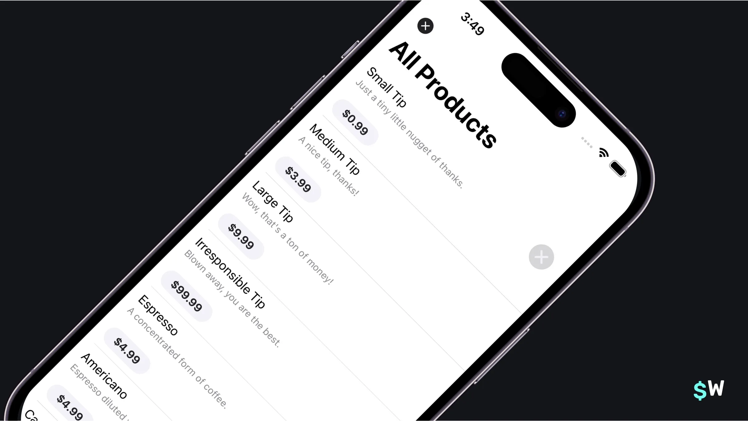
A handful of modifiers let you tune the presentation:
StoreView(ids: PurchaseOperations.allProductIdentifiers)
    .storeButton(.hidden, for: .cancellation)
    .productViewStyle(.compact)
    .bold()
The .storeButton() modifier controls button visibility, while .productViewStyle() adjusts the layout — options include compact, large, and full-height styles.
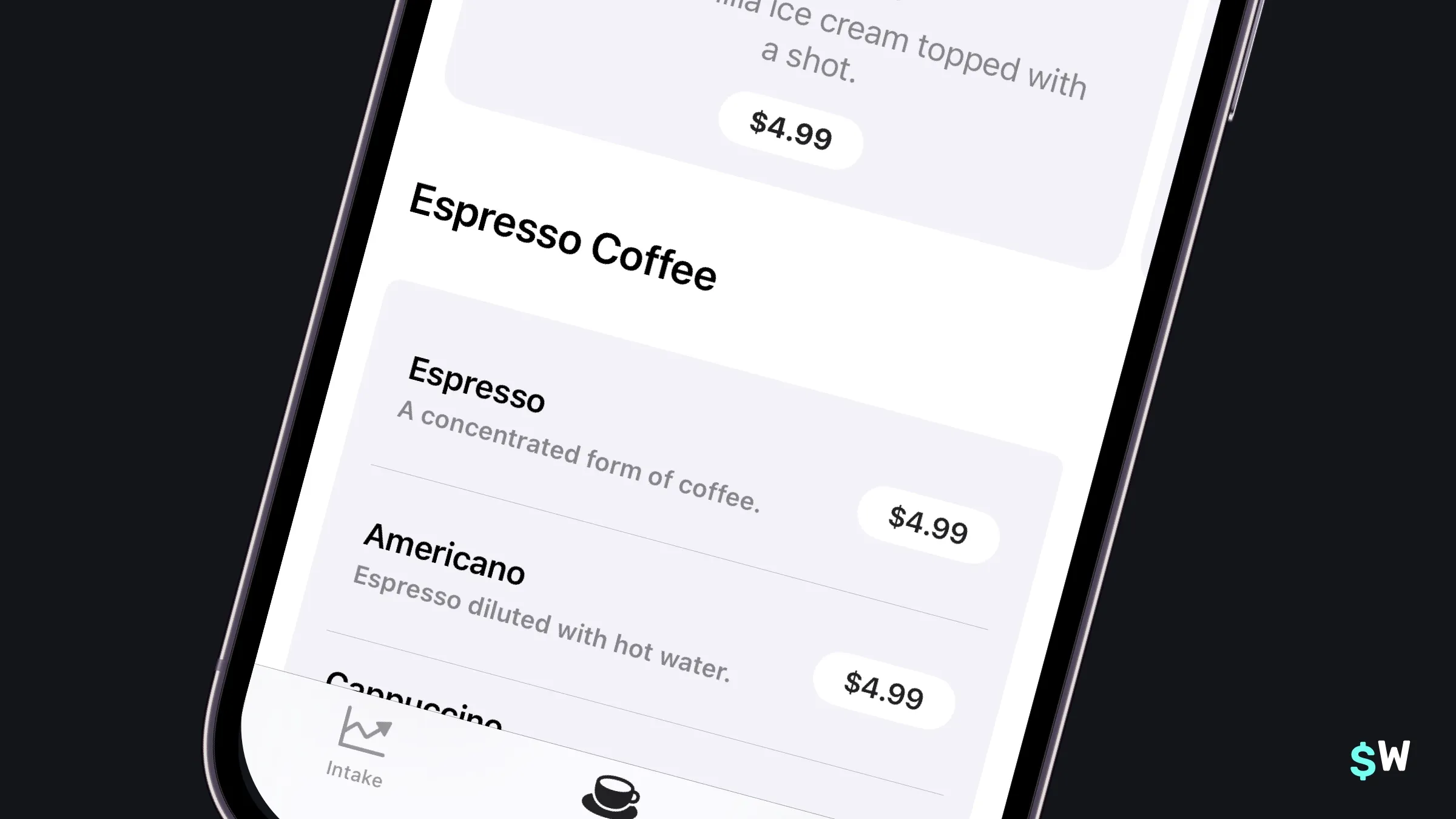
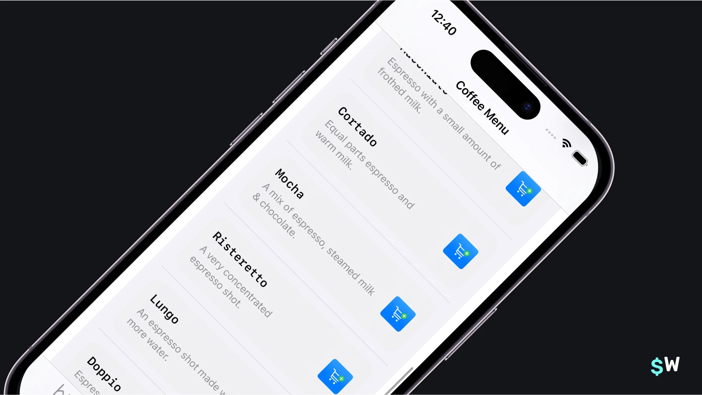
Showing singular products
The Recipes tab shows off individual espresso-based drink recipes and the
steps to make them that users can buy. Individual products are a great fit
for ProductView, which maps one-to-one with a specific
offering:
ProductView(id: drink.skIdentifier) {
    Image(drink.imageFile())
        .resizable()
        .scaledToFill()
        .clipShape(RoundedRectangle(cornerRadius: 8))
}
.productViewStyle(.large)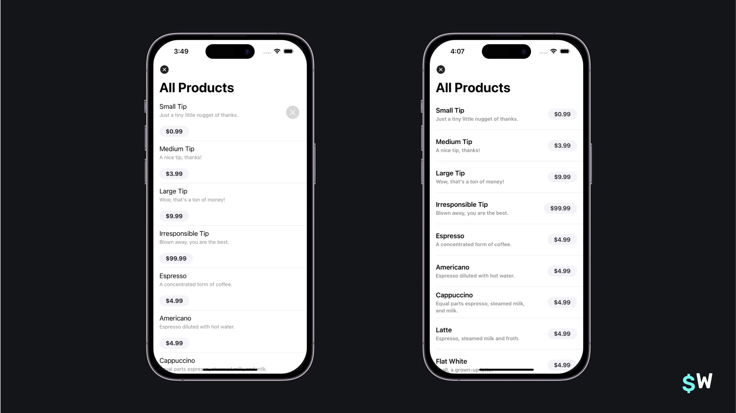
The closure parameter supplies custom iconography that adapts based on the selected style. In lists, the compact style optimizes for space:
ProductView(id: drink.skIdentifier)
    .bold()
    .productViewStyle(.compact)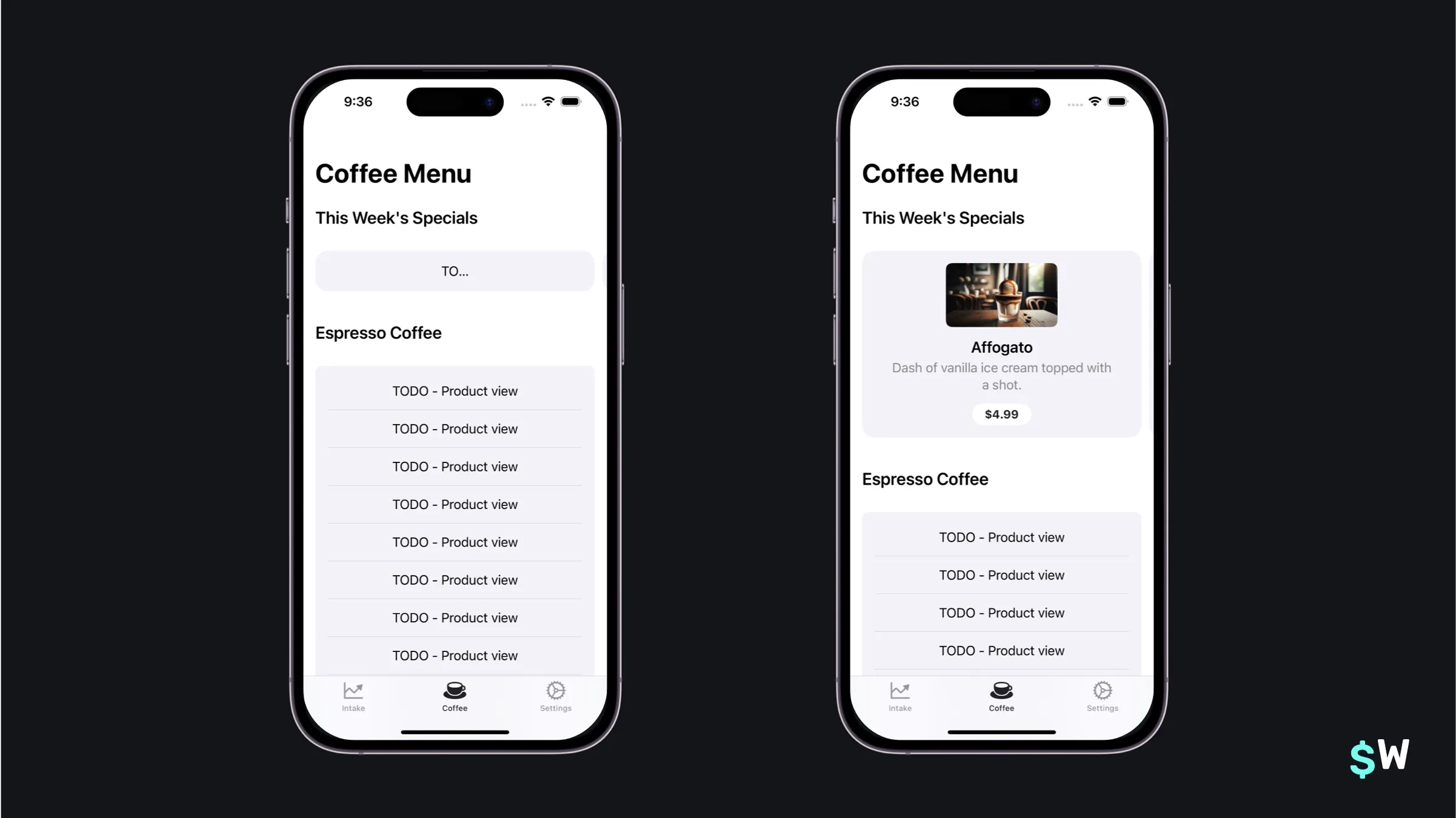
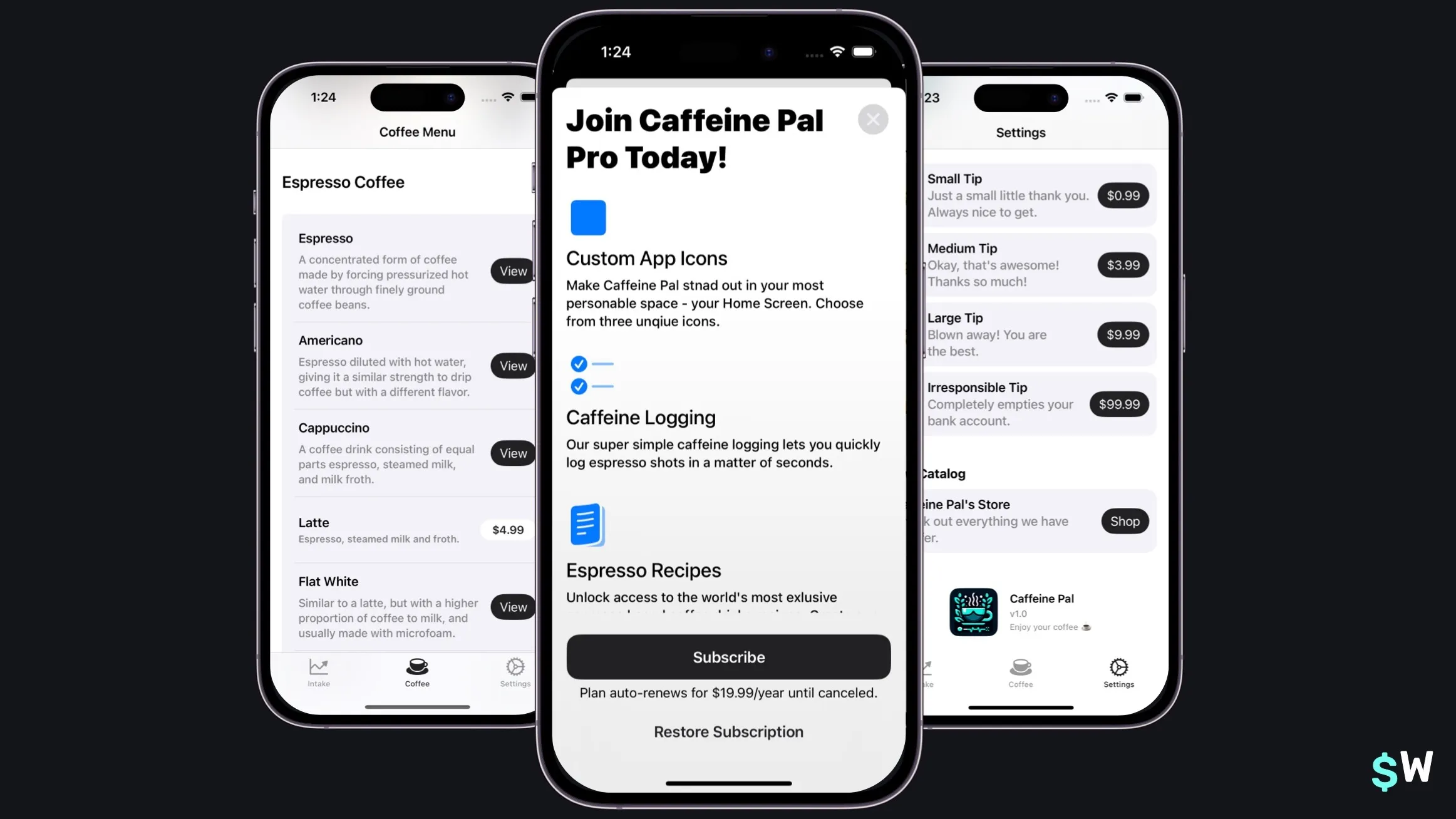
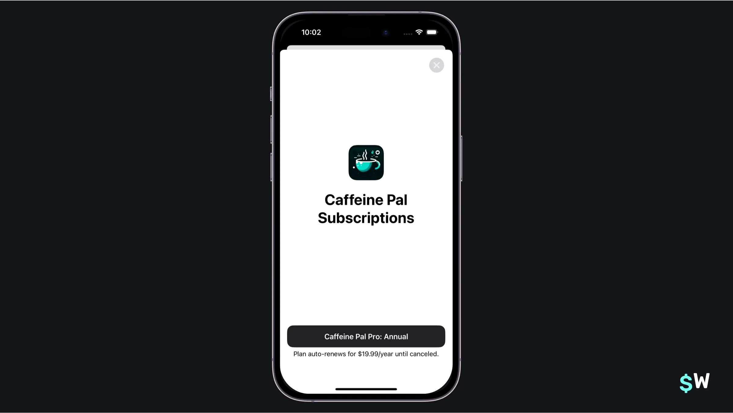
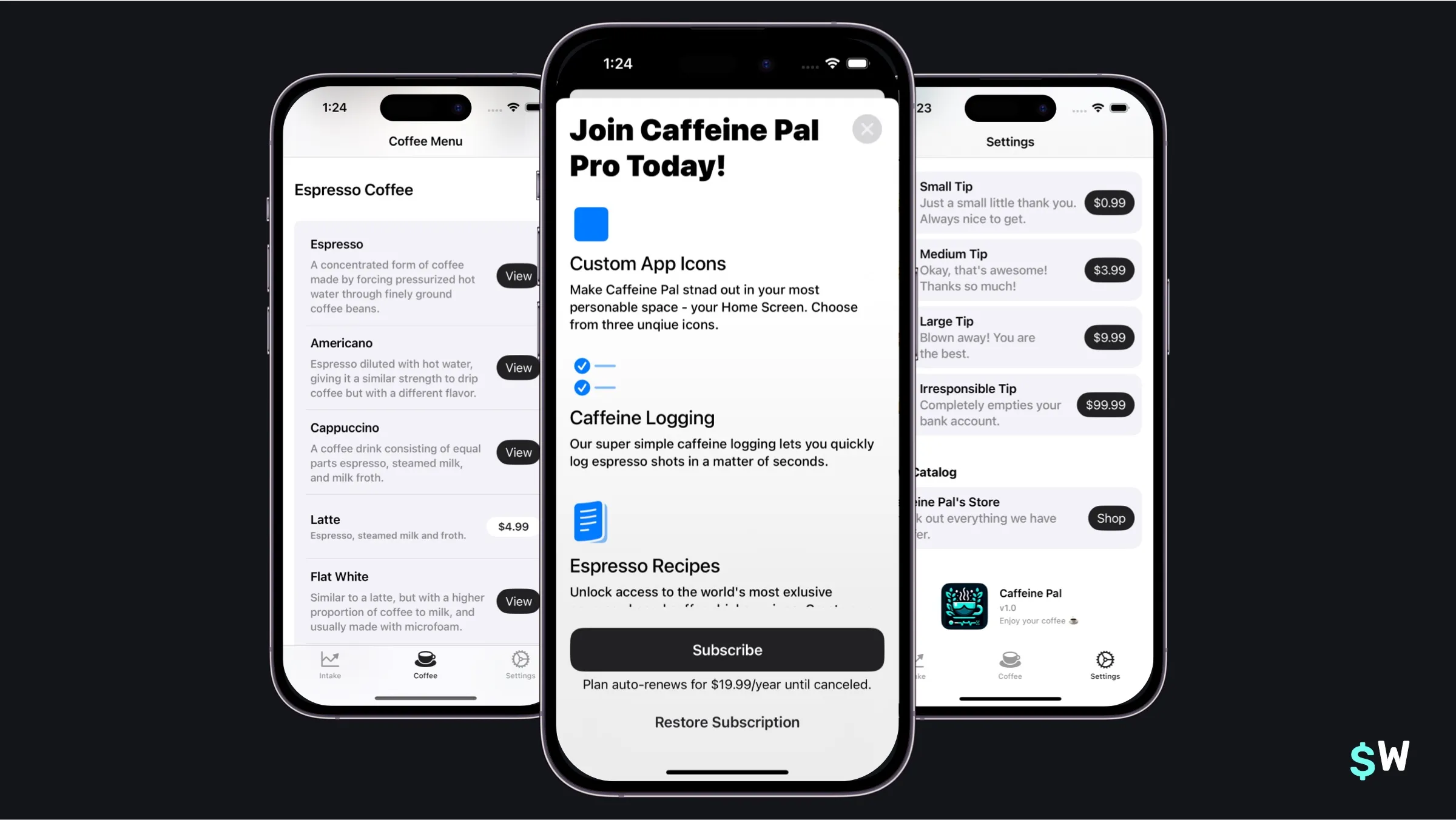
Subscriptions
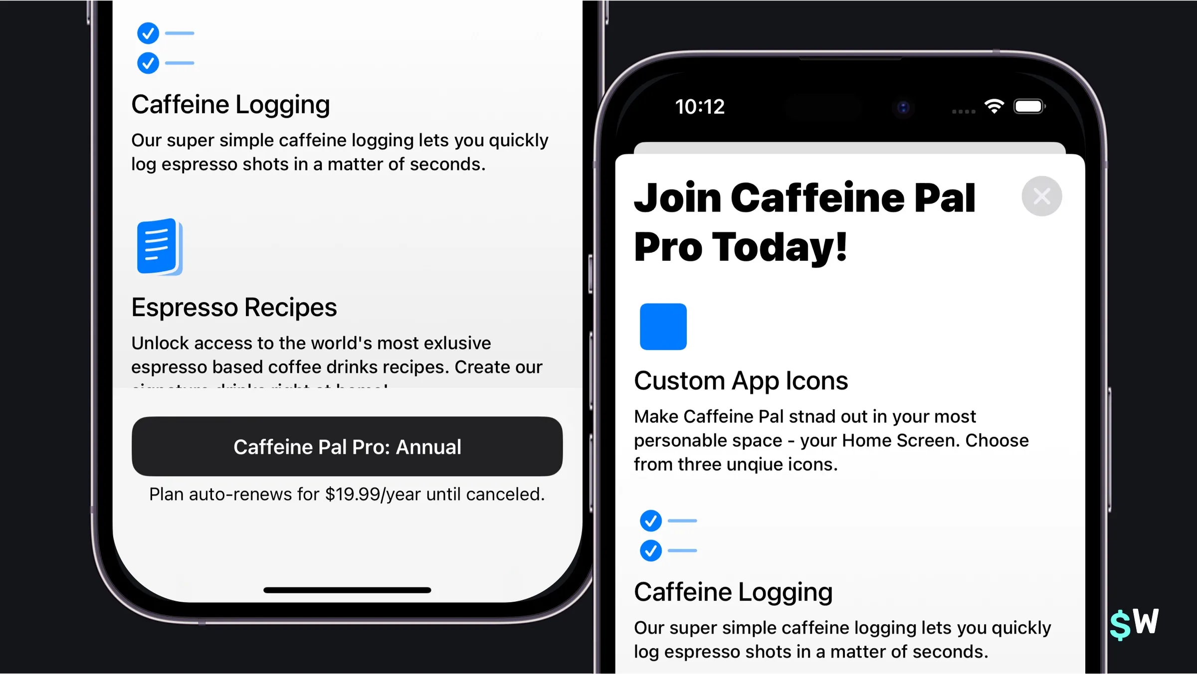
Open up SubscriptionView.swift to get started. The SubscriptionStoreView handles subscription-specific presentation with flexible customization:
SubscriptionStoreView(productIDs: PurchaseOperations.subProductIdentifiers) {
    ScrollView {
        VStack {
            Text("Join Caffeine Pal Pro Today!")
                .font(.largeTitle.weight(.black))
                .frame(minWidth: 0, maxWidth: .infinity, alignment: .leading)
                .padding(.bottom, 16)
            ForEach(ProFeatures.allCases) { feature in
                ExpandedFeatureView(feature: feature)
            }
        }
        .padding()
    }
    .containerBackground(Color(uiColor: .systemBackground).gradient,
                         for: .subscriptionStoreFullHeight)
}
.storeButton(.visible, for: .restorePurchases)
.subscriptionStoreButtonLabel(.action)
.backgroundStyle(.thinMaterial)
.onInAppPurchaseCompletion { (product: Product,
                              result: Result<Product.PurchaseResult, Error>) in
    if case .success(.success(_)) = result {
        dismiss()
    }
}
The key modifiers here are:
-
.storeButton()— controls visibility of restore purchases and other buttons. -
.subscriptionStoreButtonLabel()— customizes the purchase button text (.action,.subscribe, and so on). -
.onInAppPurchaseCompletion()— responds to a successful purchase.
The .containerBackground() modifier switches between .subscriptionStoreFullHeight and .subscriptionStoreHeader to customize which background presentation
area you're styling.
Advanced techniques
Every app has different needs, and thankfully StoreKit 2, and the views shown here, can adapt to just about all of them.
Custom product views
The ProductViewStyle protocol enables complete customization of
how a product is presented:
struct MonospaceProductStyle: ProductViewStyle {
    func makeBody(configuration: Configuration) -> some View {
        switch configuration.state {
        case .loading:
            ProgressView()
                .progressViewStyle(.circular)
        case .success(let product):
            HStack {
                VStack(alignment: .leading) {
                    Text(product.displayName)
                        .font(.headline.monospaced())
                        .padding(.bottom, 2)
                    Text(product.description)
                        .font(.subheadline)
                        .foregroundStyle(.secondary)
                }
                Spacer()
                Button(action: {
                    configuration.purchase()
                }, label: {
                    Image(systemName: "cart.badge.plus")
                        .symbolRenderingMode(.multicolor)
                        .foregroundStyle(.white)
                        .padding(8)
                        .background(.blue.gradient, in: .rect(cornerRadius: 4))
                })
                .buttonStyle(.plain)
            }
            .padding()
            .background(.thinMaterial, in: .rect(cornerRadius: 16))
        default:
            ProductView(configuration)
        }
    }
}
The configuration object provides access to the underlying product,
loading states, and the purchase() method to kick off a
transaction.
Icon customization options include:
// Custom icon in subscription view
SubscriptionStoreView(productIDs: PurchaseOperations.subProductIdentifiers) {
    // Content...
}
.subscriptionStoreControlIcon { subscription, info in
    Image(systemName: "use.sfSymbol.based.on.plan")
      .symbolRenderingMode(.hierarchical)
}

// Promotional badge in product view
ProductView(id: drink.skIdentifier, prefersPromotionalIcon: true)

// Custom image with promotional border
ProductView(id: drink.skIdentifier) {
    Image(drink.imageFile())
        .resizable()
        .scaledToFill()
        .clipShape(RoundedRectangle(cornerRadius: 8))
}
.productIconBorder()
Customized loading screens
The .storeProductTask(for:) modifier gives you granular control
over loading states:
@State private var fetchState: Product.TaskState = .loading

var body: some View {
    HStack {
        switch fetchState {
        case .loading:
            ProgressView()
                .progressViewStyle(.circular)
        case .success(let product):
            Text(product.displayName)
        case .unavailable:
            Text("Product unavailable.")
        case .failure(let error):
            Text(error.localizedDescription)
        @unknown default:
            EmptyView()
        }
    }
    .storeProductTask(for: productIdentifiers) { state in
      self.fetchState = state
    }
}
For StoreView, a phase-based closure offers similar
functionality:
StoreView(ids: productIdentifiers) { product, phase in
    switch phase {
    case .loading:
        ProgressView()
            .progressViewStyle(.circular)
    case .success(let productIcon):
        productIcon
    case .unavailable:
        Text("Product unavailable.")
    case .failure(let error):
        Text(error.localizedDescription)
    @unknown default:
        EmptyView()
    }
} placeholderIcon: {
    ProgressView()
        .progressViewStyle(.circular)
}
Responding to events
Several modifiers handle purchase-related events:
onInAppPurchaseStart— triggered when a purchase begins.-
onInAppPurchaseCompletion— triggered after a purchase completes. -
subscriptionStatusTask— monitors subscription status changes. currentEntitlementTask— tracks entitlement state.
These complement the Transaction.updates async stream for comprehensive
event handling.
Exploring trade offs
As with any engineering project, there are pros and cons to using any API. StoreKit views are no exception.
Advantages
- Multiplatform compatibility across Apple devices.
- Automatic product fetching and management.
- Built-in localization and accessibility support.
- Customizable through protocols and modifiers.
- Sensible, production-ready designs out of the box.
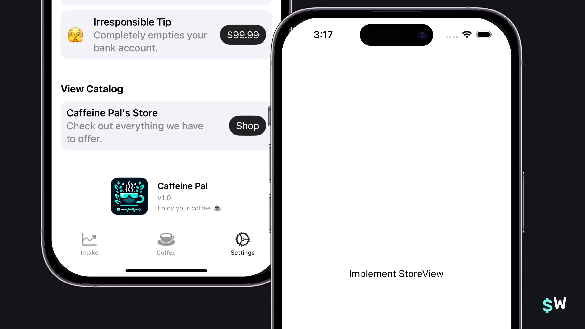
Limitations
- Limited customization of subscription footer elements.
- Fixed button placement for restore purchases and other controls.
-
Product views follow a rigid "icon-name-description-button" structure
(customizable via
ProductViewStyle). - Plan-switching flows from footer areas lack native support.
- Subscription view footer composition has constraints.
These constraints reflect the current API and may evolve in future iOS releases.
Wrapping up
StoreKit views are wonderfully simplistic from an API standpoint. Their primary strength lies in that simplicity — you can launch a functional paywall with minimal code. Success comes down to aligning the framework's capabilities with your app's specific requirements.
For apps that prioritize rapid testing, experimentation, and detailed analytics, a tool like Superwall adds templates and optimization features on top. The choice between native StoreKit views and an alternative comes down to your customization needs, timeline, and revenue-optimization goals.