How to Build Multi-Tiered Paywalls
A step-by-step guide to creating multi-layered product offerings in a single paywall.

Several companies and their corresponding apps offer tiers of service. A popular example is Netflix, which uses a pricing model where each tier adds features along with higher costs.
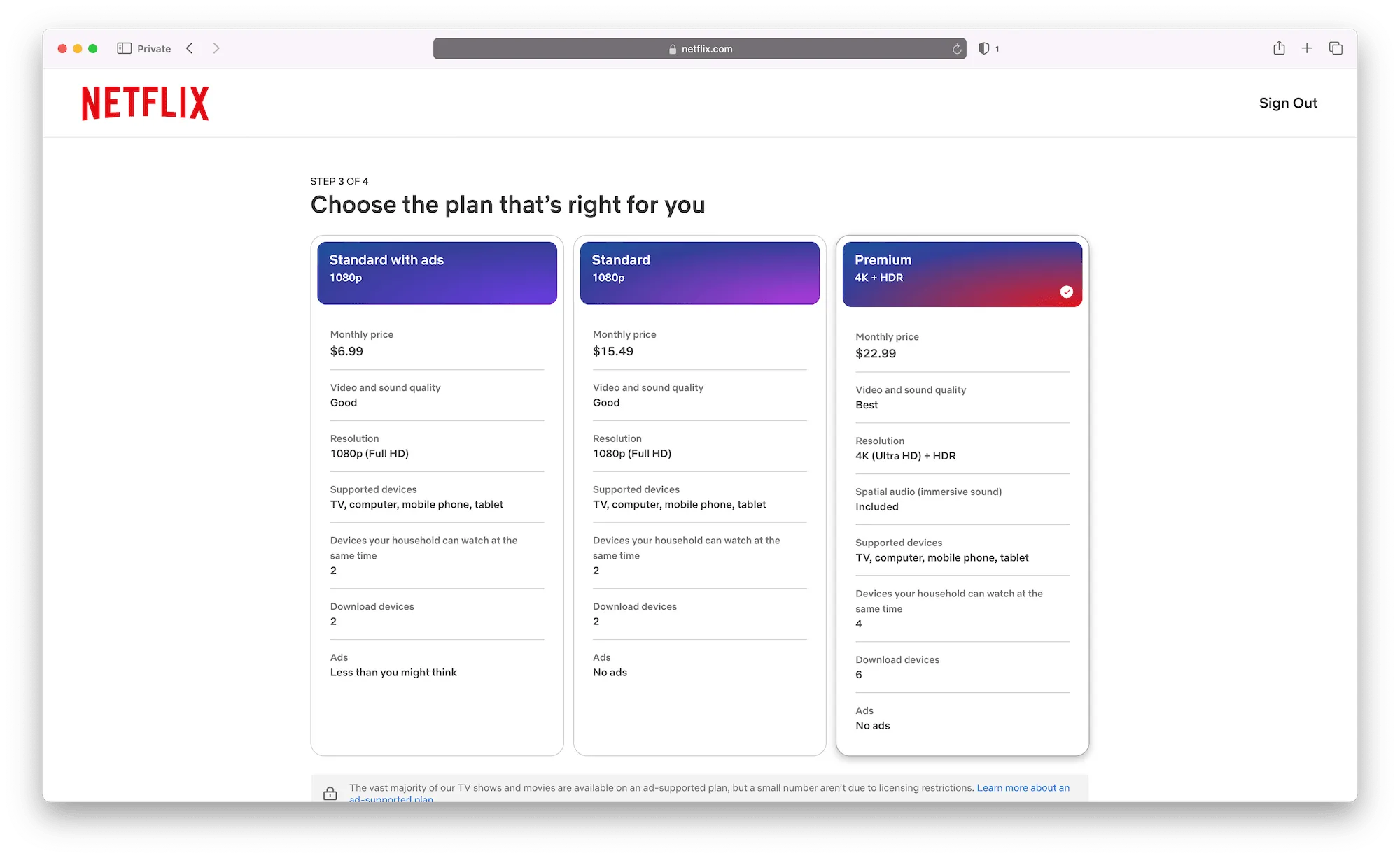
This tiered structure is increasingly common in consumer apps. For instance, your photo editing app may start with these subscriptions:
- Annual at $19.99
- Monthly at $3.99
Though, adding a new feature powered by a 3rd party service, such as an external API, might lead you to introduce a higher-priced tier:
- Annual Plus Standard at $29.99
- Monthly Plus Standard at $5.99
To showcase these pricing tiers, a typical approach is to include a toggle that shifts between options. It may toggle a 'standard' and 'pro/premium/etc.' set of plans, or different offerings within the same subscription duration (i.e. monthly or yearly).

With Superwall, creating paywalls like this is straightforward. In this post, we'll build one using our paywall editor.
Our multi-tier paywall
Here's what we will end up building:
It has four total products, representing two different tiers of service, each with a monthly and annual plan. We'll call them the "Standard" and "Plus" tiers.
To kickstart the project and focus on the important parts to help you build multi-tier paywalls, I've built the paywall up to this point.
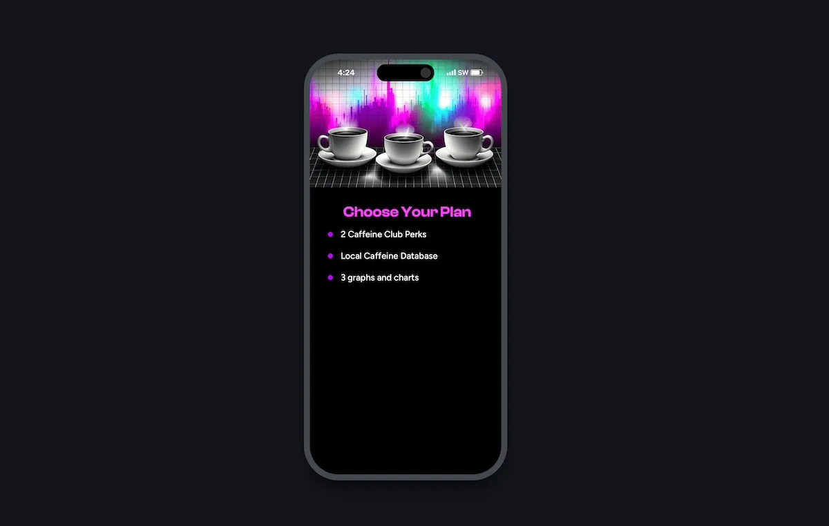
As for the rest? We'll build it together right now!
Creating a variable for a selected tier
With a design and multi-tier paywall like this, I like to start by creating a variable that represents which tier is being shown. Since we have only two options ("Standard" and "Plus"), we can use a boolean.
Now, we can have elements read or update this value to control which tier
will show in the design. When the "Standard" toggle is tapped, we'll set
state.isShowingStandard to true, and flip it to false when the
"Plus" tier is tapped.
And, in the end, that is all you need to understand if you want to build a custom paywall like this: Just create a variable to represent which tier to show, and then you're free to have elements react any way you need.
Speed up your design by using Superwall components
Using Superwall's prebuilt components can speed up any design, and it's no
different here. By using the "Segmented Picker (2 Products)", we can retool
it to toggle our state.isShowingStandard instead of toggling products.
From there, we can change the tap behavior for each segment to update
state.isShowingStandard. Here, I've made it to where tapping the
"Standard" button will set state.isShowingStandard to true (and
we do the opposite for the "Plus" button).
Some built-in components may already be styling some of their properties with an existing dynamic value. When re-purposing components, all we have to do is update those to use our own variable instead. It's easy to find these properties, too. Anything that's based off of a dynamic value will have a purple background in the editor.
Here's an example. Out of the box, the segmented component is driving its
selection indicator off of products.selectedIndex — but we want
it to use state.isShowingStandard.
Next, I'll use Superwall's "Product Group" component to add in buttons to represent product selection. I'll tweak some properties (such as making its width be 100%) to make it fit with the design, and remove the third button it came with out of the box.
Now, we just need to adjust each button's tap logic. Let's look at how our products are setup.
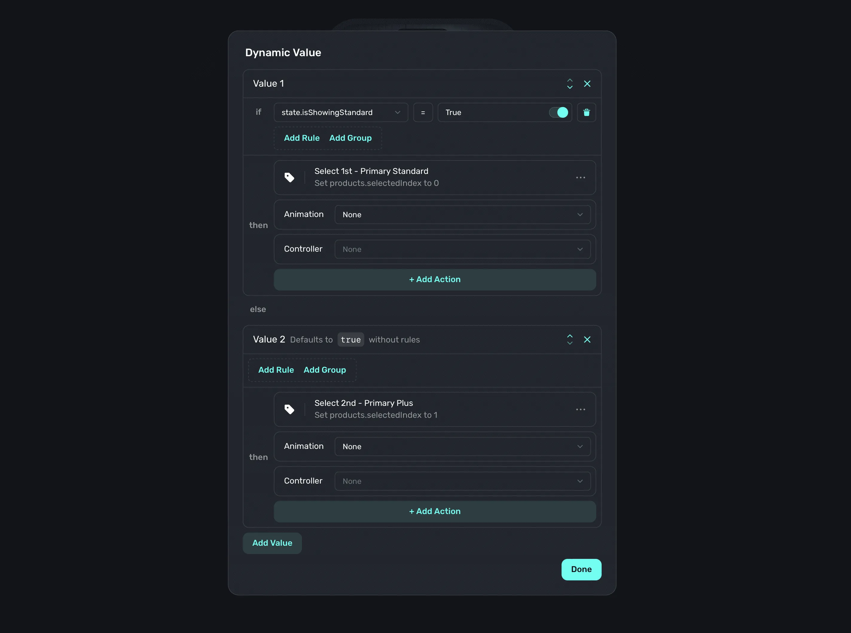
This means each button handles two products. If the "Standard" tier
is selected, then the top button should select the "Standard Annual" plan. If
"Plus" is chosen, then it should pick the "Plus Annual" plan. This is where our
state.isShowingStandard will make things easy. Even better, Superwall's
tap actions support dynamic values, which means our tap can do different things
based on what our state.isShowingStandard is set to!
For example, in our "Standard" annual button — if the the standard tier is showing, then we use the "Select Product" tap action and choose the standard annual plan. Otherwise, we'll pick the plus annual plan.
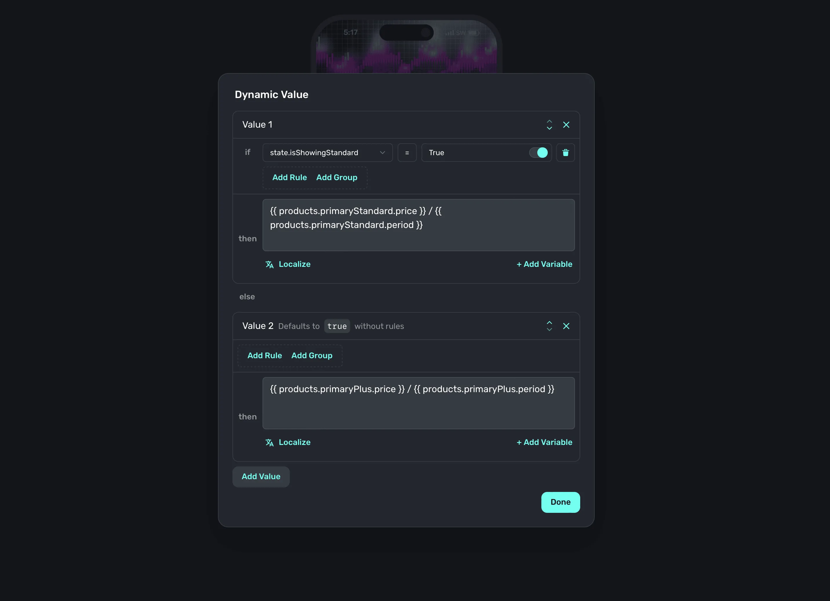
We'd extend the same logic to the button's text, so it shows the correct pricing and plan names.
Finally, we'll update any style properties set out of the box with our variable instead of the default ones (just like we did with the segment component). At this point, our design is done — all thanks to Superwall's components speeding things up.
Now, let's make the design react to each tier.
Toggling elements from variables
At this point, there are two things left to do:
- Make the interface update according to the tier that's picked.
- Add a button to initiate the purchase.
Thankfully, this is a matter of (once again) using dynamic values! I'll update things like the text bullets and header image to better represent the value of whichever tier is active.
Now, whenever we toggle back and forth — the entire interface updates accordingly. Even better, we never have to run this in our app to try it out. We can do it all in the editor, and even try out things like varying device sizes.
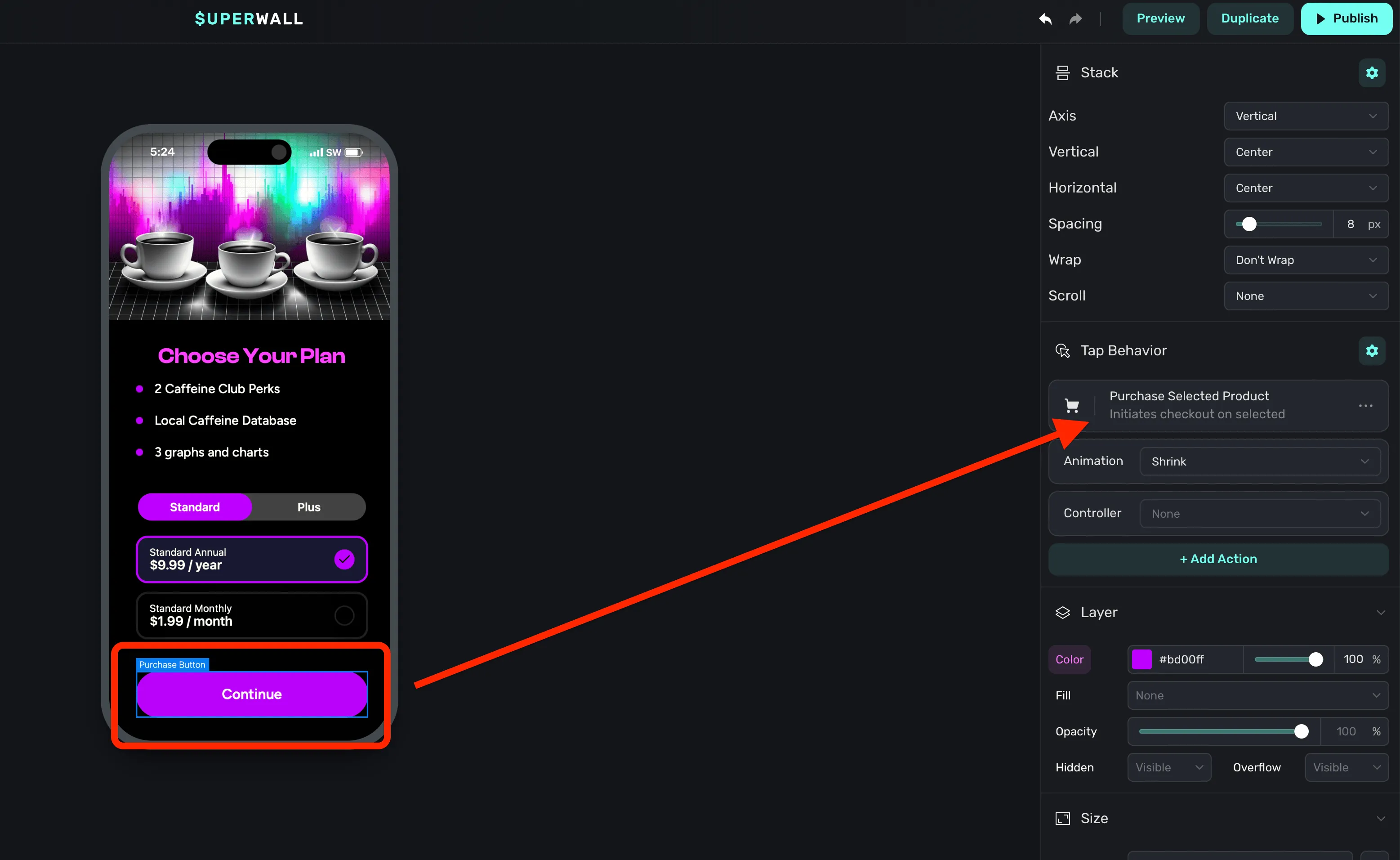
For the last touch, I've added a button from Superwall's component library
and made its tap action initiate a purchase of the selected product. This
will be trivial, since Superwall has a special variable just for this purpose
— products.selectedProduct.
Putting it all together
With that, our multi-tier paywall is ready to go. Here's an example of it running in an iOS simulator.
And that's all it takes to build out a paywall to support multiple tiers. Of course, this is just the start — you can remix this design, start from one of our templates or build something entirely new to support multiple service tiers. There's no easier or flexible way than with Superwall.
If you're new to Superwall, you can get started for free today. Just fill in the details below. Or, if you've already integrated our SDK — then you probably already know you can get a paywall like this into production right now (no app update required).